Branding for »Gian Paolo e Marco«:
Dolce far Niente
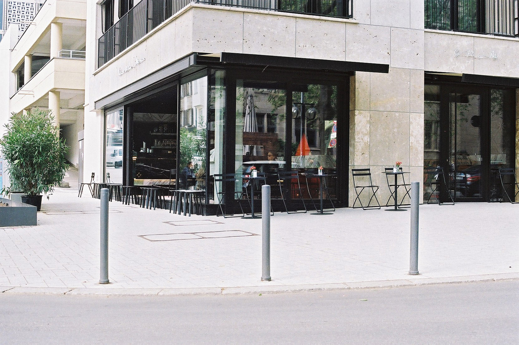
Dolce far niente: The sweetness of doing nothing quickly emerged to the bars credo. Gian Paolo e Marco provides excellent quality in service and menu. A bar that was »set in stone«, opened in September 2021 and set a new standard for modern bar interior in Stuttgart. While internationally renowned in various Arcitecture magazines we contributed to the identity of the newly established bar.
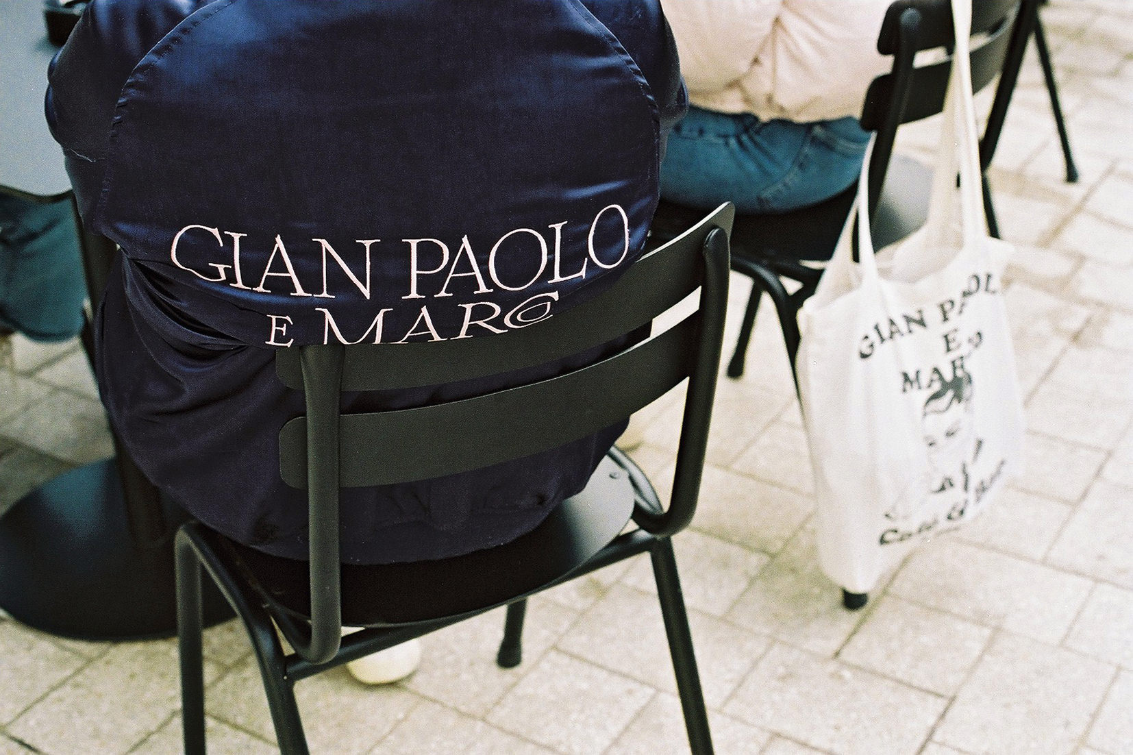
A reminiscence of old Italian craftsmanship resembles the brands story with influences of long summers and mid-century mediterranean heritage. With the virtuoso use of specially drawn ligatures we reinforced the reference to ancient Italian craftsmanship.
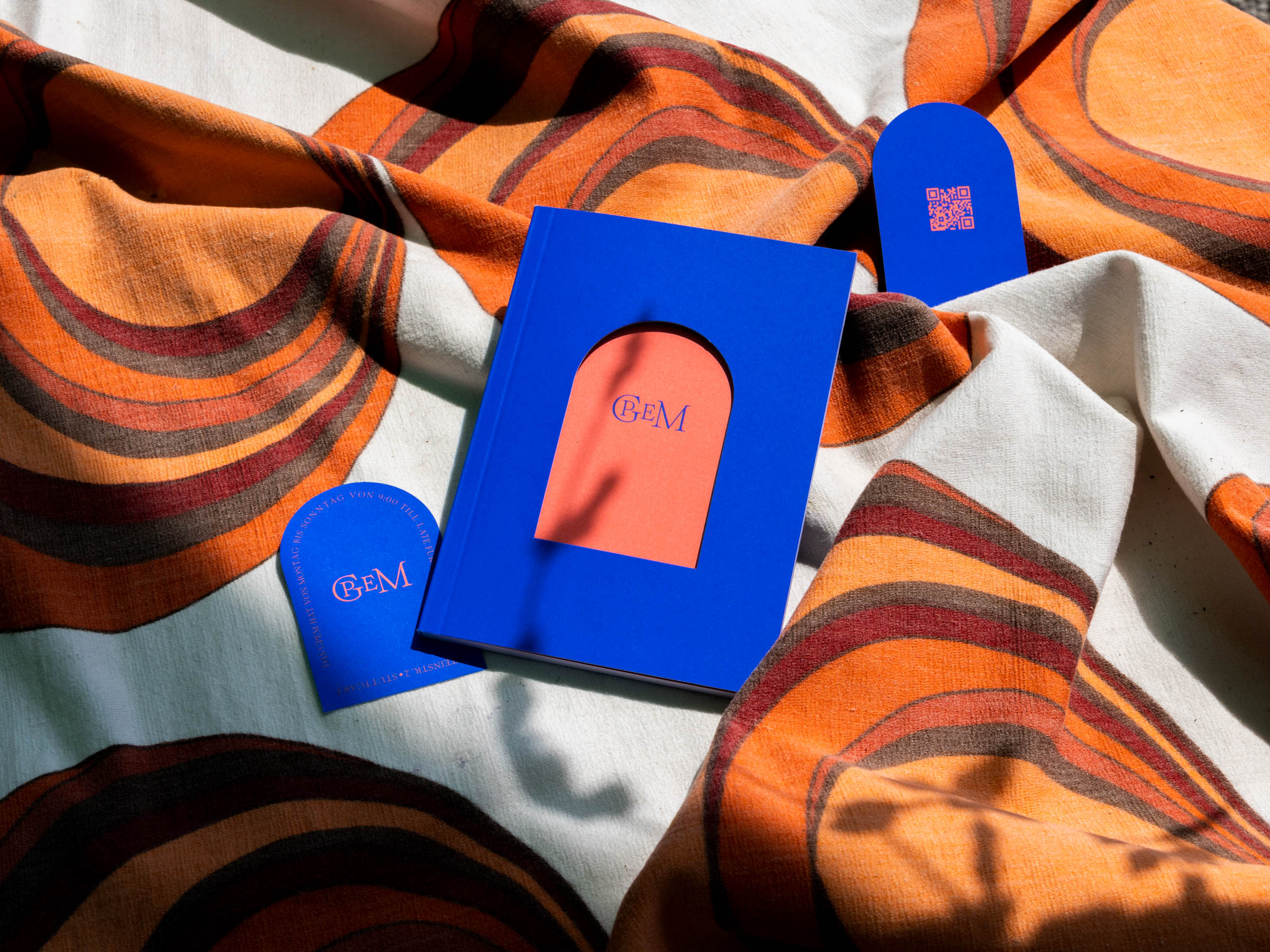
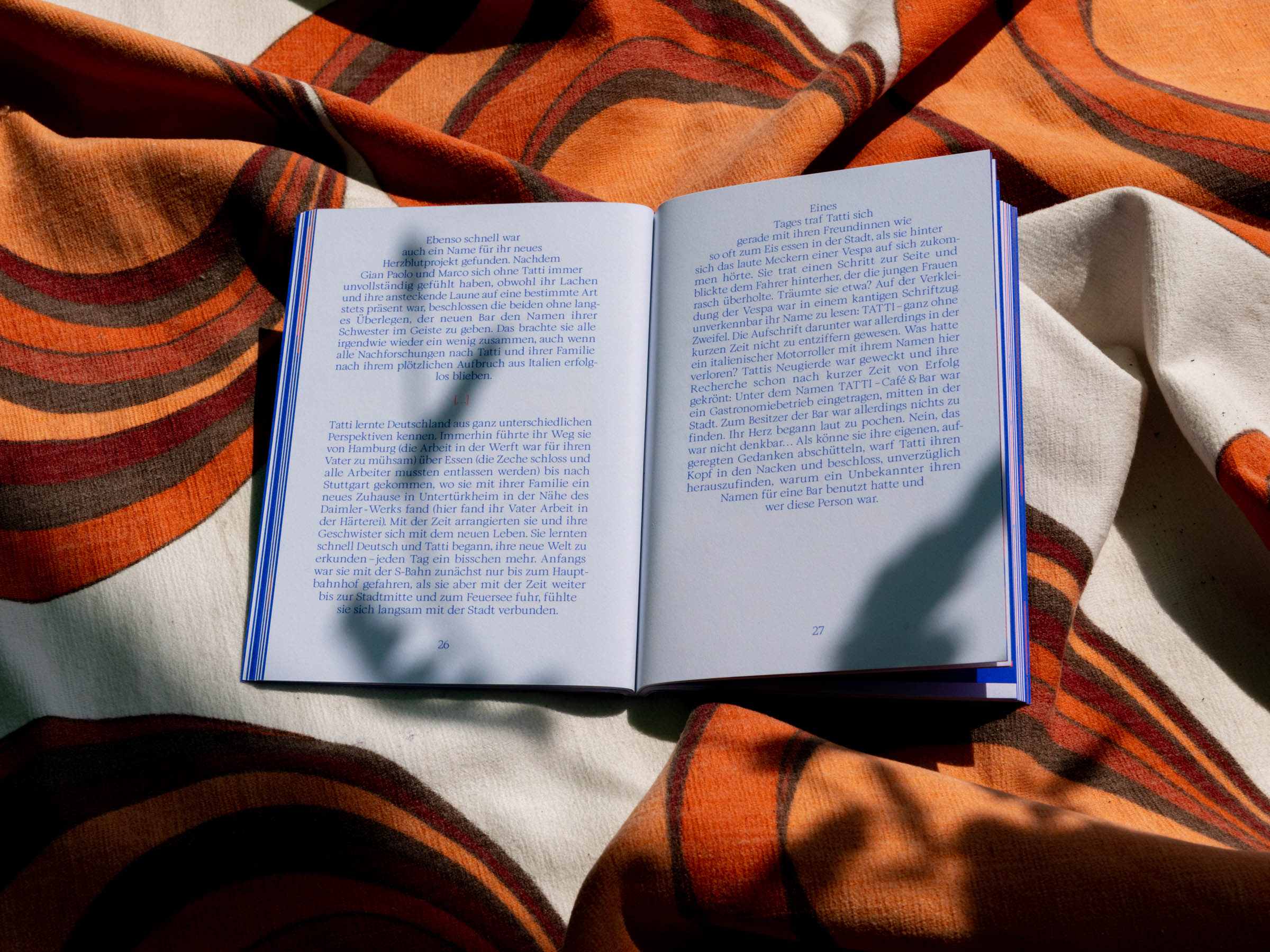
After creating the wordmark for the brand, we foremost designed a brandbook that shares the story of Gian Paolo and Marco, two bartenders that set up shop in Stuttgart.
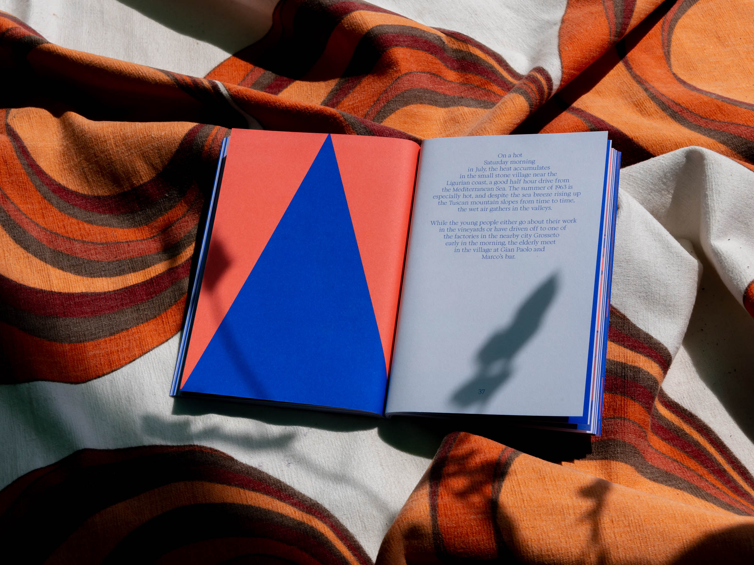
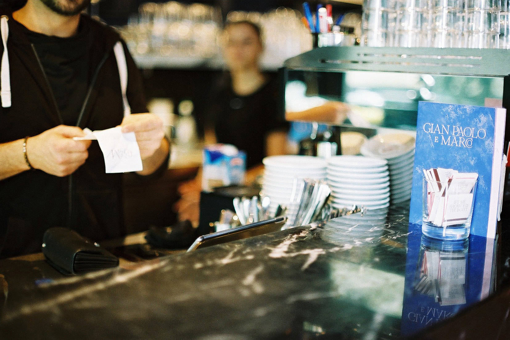
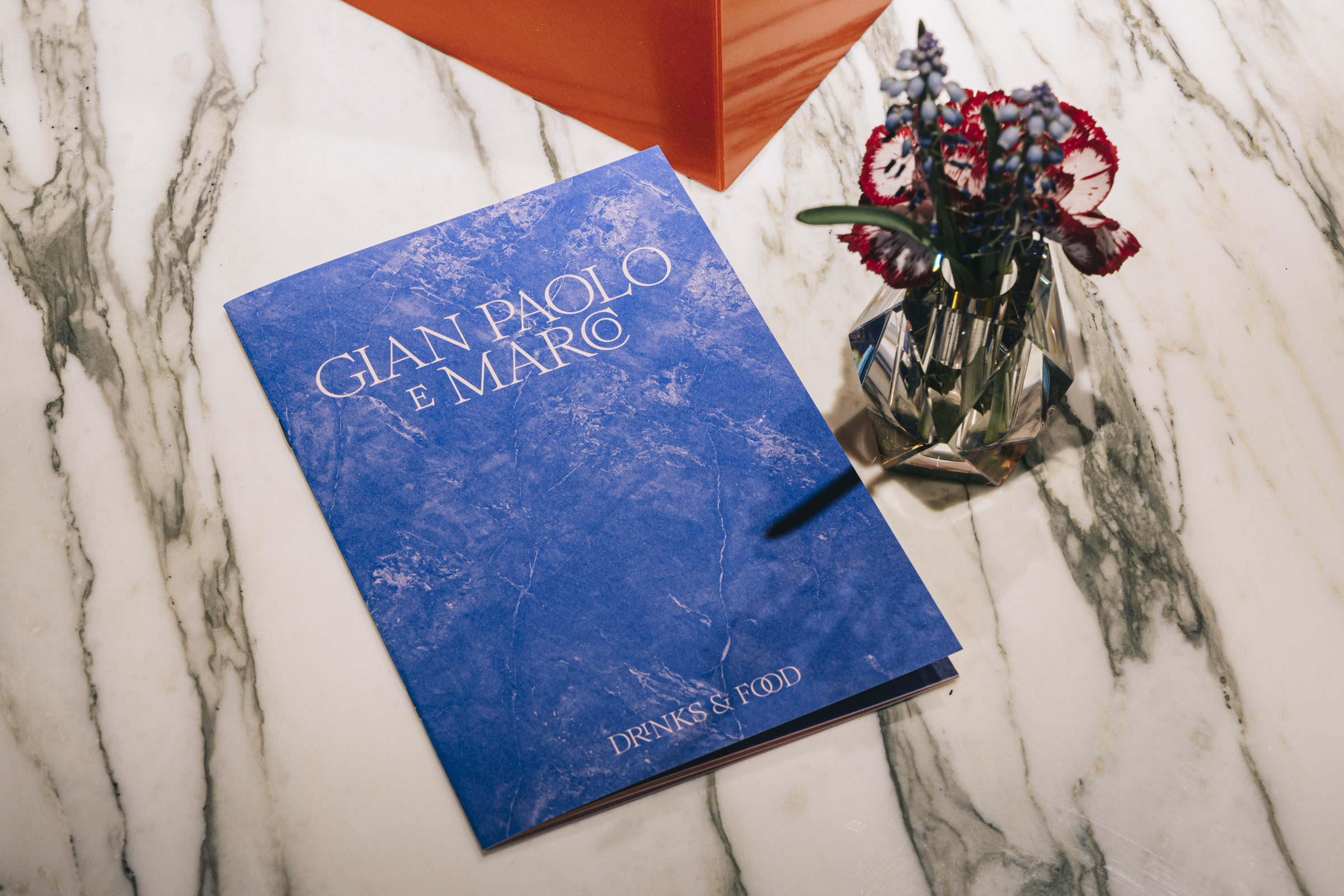
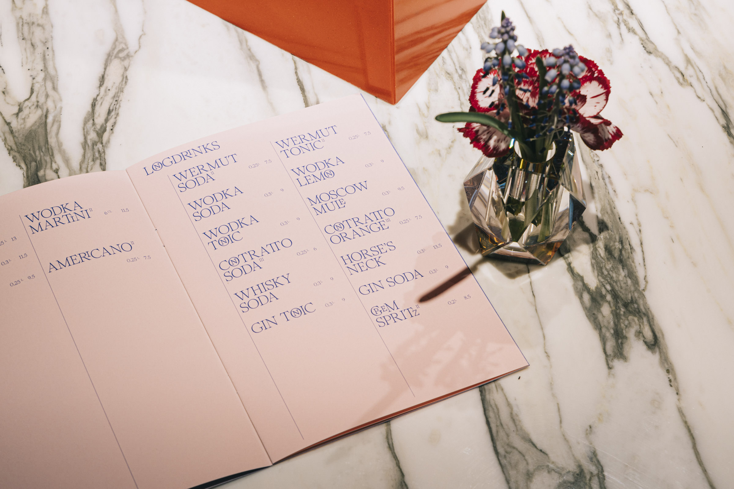
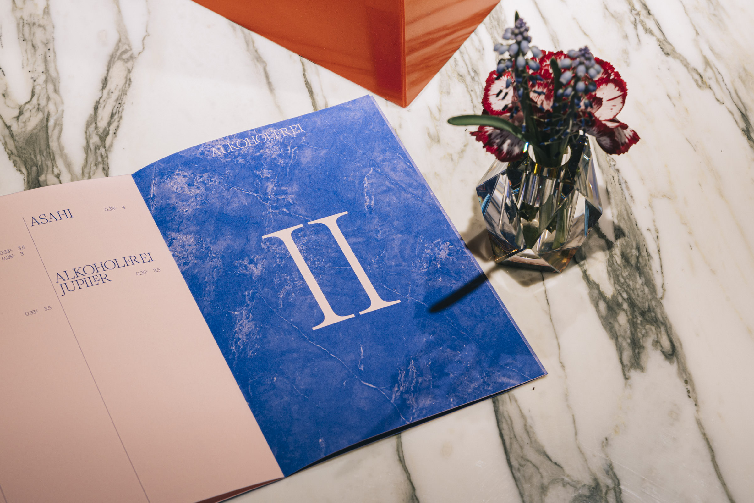
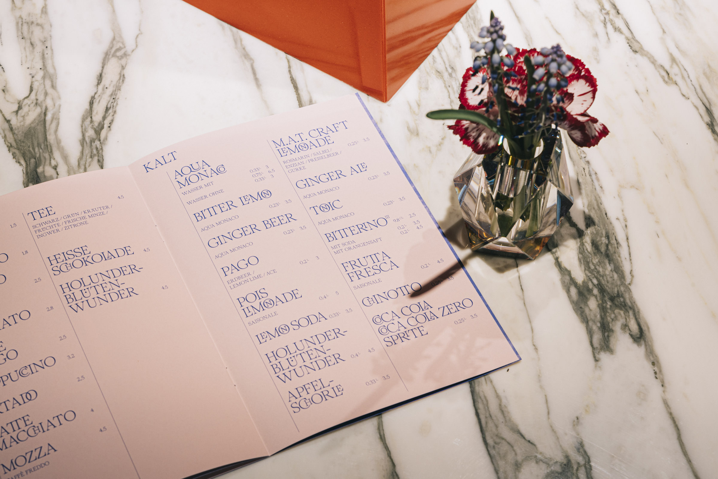
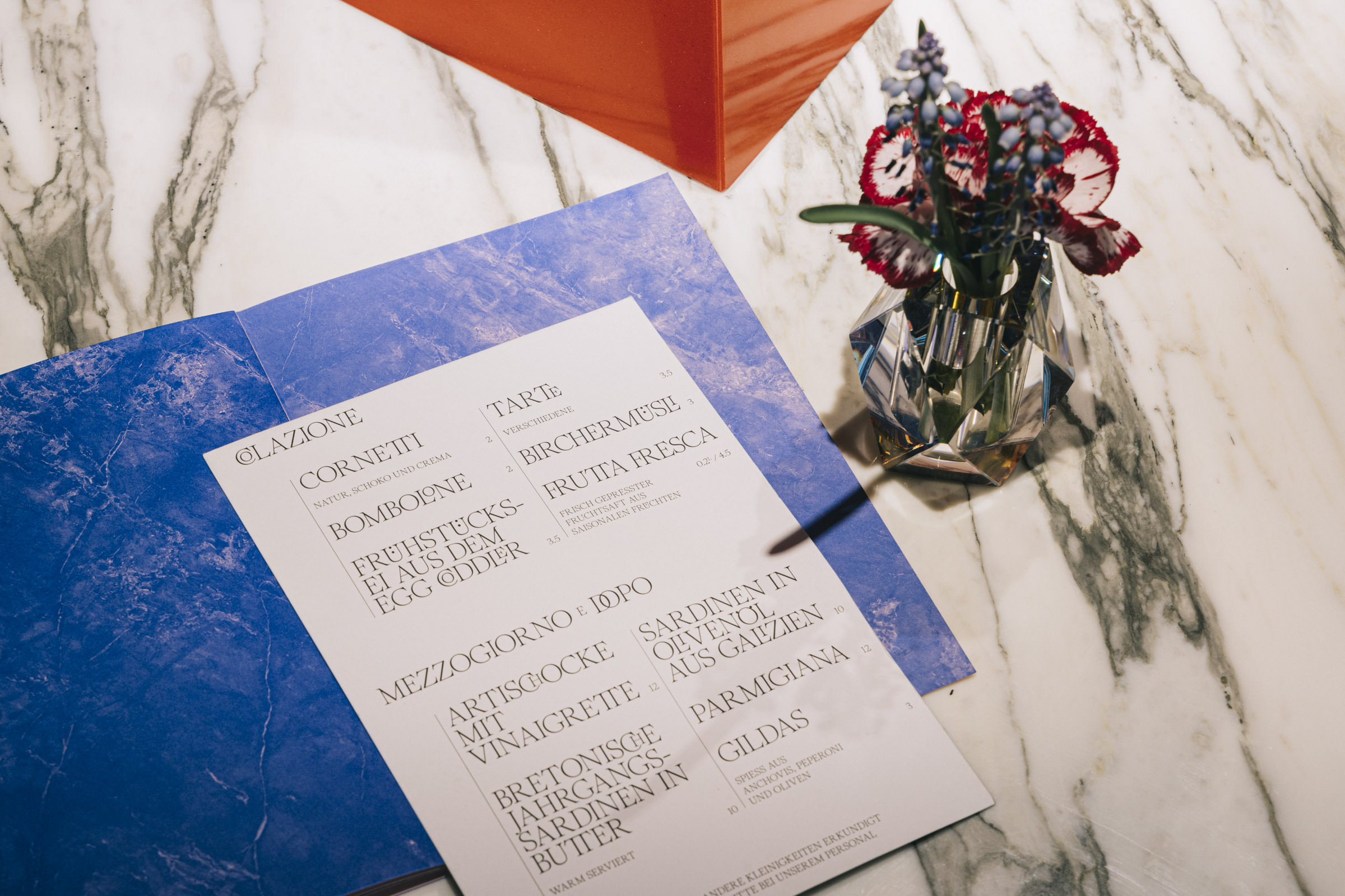
Subsequently, we applied design of Gian Paolo e Marco to various printed matter. The center-piece of every bar is its menu book. Especially with the attention to detail that was provided at »GPeM«. Identically we tried to continue this in the way we designed the menu book.
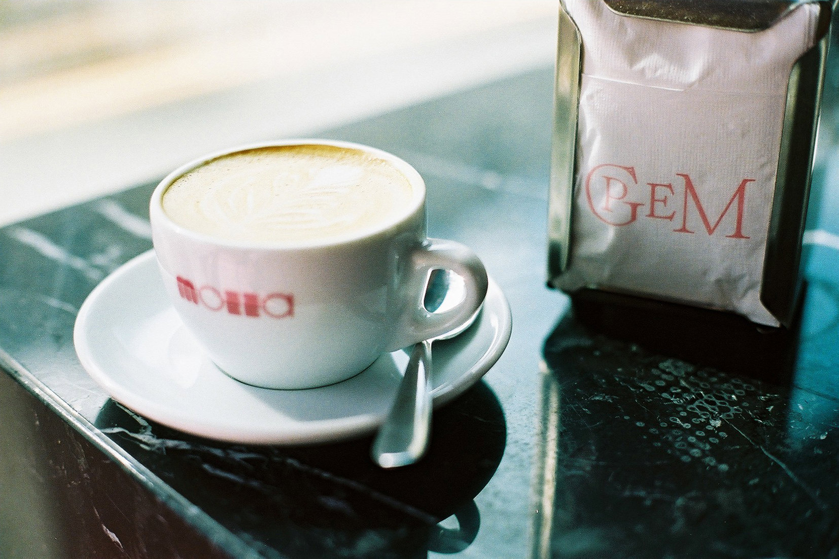
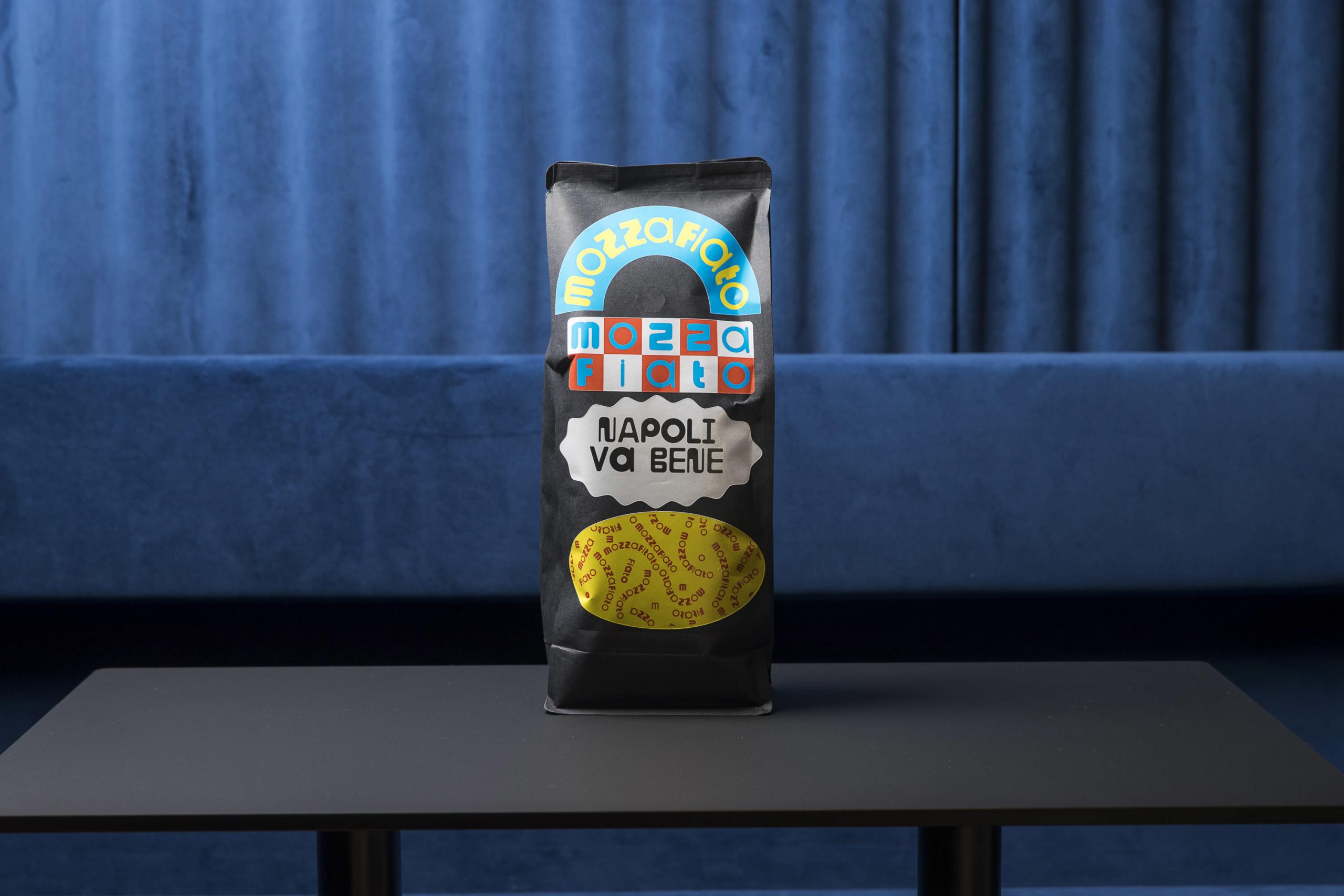
Additionally we also designed a sub-brand for Gian Paolo e Marcos very own roast — MOZZAFIATO. Accordingly, we used our very own variable typeface »Pepi« for that.

Client: |
Gian Paolo e Marco |
Partners: |
Anna-Lena Vetterkind, Benny Scheibe, Marcus Philipp, Iassen Markov, Matthias Straub, Studio Tillack Knöll |
Photos: |
Matthias Straub, Maks Richter, Sven Tillack |
URL: |
http://www.gpem-stuttgart.de |
Studio Tillack Knöll is a multicreative design practice that concerns itself with the visual and spatial aspects of communication. We design exhibitions, wayfinding systems, books, visual identities and digital experiences for a variety of clients involved in architecture, art, science and commerce to cultural institutions and NGOs.